Brand Design
Empress Hotel & Gardens
2021
Empress is a fictitious hotel and garden in Midtown Atlanta. It's well balanced and unique logo symbol is based off of Empress Genmei's Kanzashi. Check back April 28th, 2021 for the entire brand identity and fifty page corporate design manuel.
Tall Tale Brewing Co.
2021
Tall Tale Brewing Co. is a fictitious brewery based out of Macon, GA. The beer list consists of two separate lines that are distinguishable by different design approaches. The Stouts, IPAs and Lagers are advertised with whimsical illustrative labels that correlate to a familiar tall tale. These illustrations invite the consumer in through a fun and recognizable tall tale character, with each label expressing my colorful interpretation of the tale that it depicts. These labels speak for themselves, so I chose to package them in a 6-pack, black recyclable plastic can carrier leaving the label to be admired. The second line consists of the Sours and Goses that are represented by a bright and colorful graphic label that matches the beer to the associated fruit’s appearance and taste. Each one has a bookshelf design used for the label and cardboard, 6-pack box packaging. Creating two separate beer lines for Tall Tale Brewing Co. rounds out the brand’s identity with a bivalent approach that allows multiple visuals to represent a singular company. Tall Tale Brewing Co.’s identity wouldn’t be complete without its merchandise. I chose to use my primary logo with the addition of “Macon, Ga” to be represented on the grey baseball t-shirt and beer glass. The second merchandise design is a version of the Sour and Gose label designs, manipulated to display Tall Tale Brewing Co.’s tag line “Taste That Tells a Story.” The body of work is representative of my dueling love for fine art and illustration versus my love for graphic design. I believe that the two complement each other and are able to join forces creating a dynamic brand identity for all to enjoy.
Click and Grow:
Logo redesign
2019
Click and Grow is an existing company that I decided I would brand as an independent project. Click and Grow is the first ever smart garden, their small indoor herb and vegetable garden is self watering and provides it's own source of light. With technology as advanced as theirs I was shocked to find out they lacked of a proper logo. My redesign features a leaf-lightbulb hybrid. The lightbulb being a symbol of knowledge and a leaf, the symbol of nature accurately represents their table top urban garden. Mattias Lepp, CEO of Click and Grow, set out to bring light and happiness to his cold urban environment. With my redesign I believe Click and Grow could have a light and fun logo to represent themselves with.
Shots Amusement Park
2019
Shots Around the World is a project I contributed to in late 2019. My peers and I divided into groups and acted as each other's clients. Each group provided an identity list and our designs went through several revisions with the client to provide the best final product. The experience taught us the importance of good communication skills when talking to a client and the ability to adapt to each design challenge. To the left are my contributions to the final designs.
Instagram Templates
2020
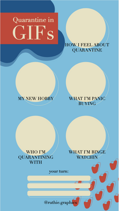
Designed Instagram story templates for my page. Check out my instagram @Ruthie.FineArt


